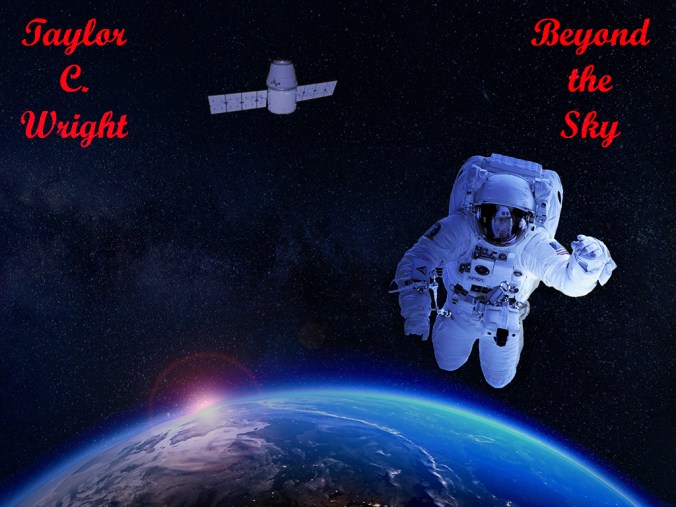
For this project, I created album art for a single release track. My project revolves around the idea of going through all the release steps for a song which includes creating album art for the release.
Designs that inspired me for this piece of album art are the album covers from Pain’s 2016 release Coming Home and The Contortionist’s 2010 release Exoplanet. The design of the album art is meant to reflect the imagery conjured up by the title of the song, “Beyond the Sky.” I used the palette from movie posters that indicate action, thrillers and sci-fi since being beyond the sky implies the idea of space.
My design process started with started with embedding an image of the Milky Way that I used for the background. After that, I imbedded the image of the of an astronaut and Earth to create the foreground image. I then outlined the astronaut with the magnetic lasso and created a new layer via copy to isolate his image. Next, I changed the color balance for the astronaut and Earth, filled in the layer in white and painted the two objects to which I wanted to have the layer applied. Once I was done with that step, I moved on to the satellite, artist name and title.
The artist name and title went on next using the horizontal type tool after choosing red as because it was another primary color that was analogous to the blue hue of the Milky Way. Following the text, I added in the satellite and erased the top part of the image which removed the docking arm, leaving only the satellite. I changed the hue/saturation and lowered the opacity of the satellite to make it feel less dramatic and make it look like it was farther away. Finally, I changed the highlights in the color balance to make the Sun look brighter to make it reflect a more natural experience.
I collected all the elements for this project from Pixabay. The process was to add in elements that are thematically correct and then adjust the elements as I went to create the mood I wanted to create. The tools I used were the horizontal type tool, the erase tool, the paint bucket tool, the magnetic lasso, the brush tool and the rectangular marquee tool. The only technical difficulty I had was not knowing how to resize a layer which was quickly solved with a Bing search (Ctrl + T).
The materials I used were all listed with Creative Commons licenses, all stated they are free for commercial use and with no attribution required.
Satellite: https://pixabay.com/en/satellite-spacex-aeronautics-nasa-693191/
Astronaut: https://pixabay.com/en/astronaut-astronomy-satellite-moon-1849401/
Milky Way: https://pixabay.com/en/milky-way-starry-sky-night-sky-star-2695569/

Hi Taylor,
Great design! I really like the overall theme of the image and how you incorporated multiple images into one design.
A couple ways that I feel you could improve on your concept is to remove the floating text by better placement. The line that has already been created by Earth at the bottom on the image gives a natural resting point for the eye to focus on. Another thing that I noticed is that there may not be enough room to make this possible with the astronaut being in the place it is currently. You may want to move the astronaut up and then place the text in between him/her above the planet. The text may look a little cleaner if it follows along with the same color aesthetic of the whole piece. This may be in an overlay on a bright silver stars image, such as the one linked here… https://www.pexels.com/photo/gray-textile-751378/ I am also questioning the overall size of the satellite behind the astronaut and the how it looks in contrast.
LikeLike
Hi Taylor,
I have enjoyed reading your blog, and I really like the general theme of the page. The graphic design project draft is really nice, I like the theme of it. I think one of your strongest points in album art for your single release track, is the theme that is trying to tell the story. It says “Beyond the Sky” and your content, the astronaut and satellite are all in space, above the sky. But I feel like the words are out-of-place, it doesn’t give me the full immersion of being in space. What you could maybe change are the font and color, I think changing the font to a more modernized font will help fit the theme. And also maybe changing the color from red to cold colors would also help shape the theme to a much more consistent end product. One other thing that isn’t world breaking, but has the potential is that the text below the image, I sometimes find it difficult to follow where I am reading because of the background and the words color. But overall, a great album art, and I enjoyed reading it.
LikeLike
Hello Taylor,
I love this image that you have created. All of the elements you used work together seamless, and I honestly would not suspect they were multiple pictures used to make one. This would be a cool album cover, great Job. With that said my first suggestion would be to change the color of the text. That bright red in contrast with the rest of the picture is a bit harsh on the eyes. I think if you used that pinkish purple hue that is rising over the Earth for the text color it would create greater harmony for your image as a whole. Another suggestion is to maybe change the layout of the test. Currently your text is kind of thrown into the corners, which makes it look blocky and out if place compared to the smooth visual underneath. You could possible straighten out the alignment and bring it down, I think this would help connect it to your image more.
-Chase Johnston
LikeLike
Hi all,
Thanks for the feedback, it is much appreciated. For the redesign, the first thing I would address would be the color of the text. Instead of it being a bright red, I will check to see how it would look with the suggested color changes: pinkish purple, a bright star overlay, or using more of a cold color palette such as grey or steel. The next item on my original item that I received the most feedback on was the placing of the text. Once I change the color scheme, I will test it in different locations as suggested. Depending on the look, options would be vertical on the sides to frame the picture in or possibly following the line of the Earth where it meets the Milky Way background. Moving the text would segue to the final suggestion which would be moving the astronaut. If the text is moved, that would open the top part of the image and allow much more room to work with on the upper half of the design.
-Taylor C. Wright
LikeLike
Hi Taylor,
Excellent design!! I actually don’t see any specific area to improve in your design. But I will try to find some which might help you in final graphic design project.
I loved your theme, which is perfect for the title of the album. The pictures used in the design are blended so well with each other. Your design already is almost like professionals. Though there is nothing particularly needed to change in the design, I would like to suggest few ideas that you could consider in your final project. The first suggestion would be change in the color of the text. Bluish hue color would work great for the text. Along with that, You could change the placement of the text for better result. In my opinion, your name could be placed in top middle of the cover with smaller font size and name of the album underneath your name with larger font size. Aside from that, I think that there isn’t anything to improve.
-Anjila Sharma
LikeLike